We’re back with another round of upgrades, focused on making your reporting experience more connected and customizable.
From pulling data directly from Google Sheets to integrating multiple GA4 accounts into one view, this release is all about reducing manual effort and giving you clearer, faster insights.
Here’s what’s new, what’s improved, and what’s coming soon.
What’s New?
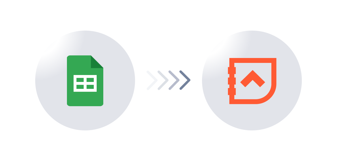
Google Sheets Integration
Bring your spreadsheet data into Revlitix reports—no manual copy-pasting required.
Why it matters:
Teams often manage key metrics in Google Sheets—especially budgets, lead tracking, and partner performance. Now, instead of switching between tools or exporting/importing data, you can connect Sheets directly to your reports.
Use Case:
A performance marketer managing ad spend by region in Google Sheets can now integrate that data with campaign results from Meta and Google Ads inside Revlitix. This helps track actual spend versus pipeline outcomes in one place, without juggling tabs.
Multi-Account Integration for GA4
Now you can connect and manage multiple GA4 properties in Revlitix.
Why it matters:
If you're managing analytics across multiple brands, websites, or client properties, toggling between different GA4 accounts gets tedious. This update allows you to integrate all GA4 views in a unified dashboard.
Use Case:
A demand gen leader overseeing five microsites can now view performance metrics—like traffic, bounce rates, and goal completions—across all properties in one consolidated report. No more fragmented analysis or missed insights.

What’s Improved?
Bar Chart Summation Options
You can select multiple options—Total, Min, Max, and Average values—in your bar charts for clearer insights.
Why it matters:
Sometimes, the insight isn’t just in the individual bars—it’s in the aggregate view. This update makes it easier to understand overall trends or spot outliers with one glance.
Use Case:
A RevOps manager comparing quarterly performance across sales regions can now quickly view total deal values, average conversion rates, and top/bottom performers—all directly in the bar chart without exporting the data.

Notes & Scheduled Reports for Waterfall Charts
You can now add context to your Waterfall charts through notes and schedule them for recurring delivery.
Why it matters:
Waterfall charts are great for visualizing progression or change over time—but they often need context. With notes, you can annotate performance shifts directly on the chart. With scheduling, you make sure stakeholders get those insights regularly.
Use Case:
A Head of Marketing tracks the change in weekly MQLs with a Pipeline Waterfall chart. Now they can annotate a sudden drop ("Paused LinkedIn Campaign") and schedule that report to go out to the VP every Monday with updated values.

Coming Soon
Gauge Charts
Track performance against goals with intuitive gauge visualizations.
Pipeline Waterfall Raw Data
Drill down into raw data for deeper analysis in Pipeline Waterfall charts.
Auto-Generated Notes & Summaries
Let Revlitix auto-generate periodic summaries for your reports.
Improved Report Slides
Better layouts, smoother formatting—smarter slides are on the way.
Final Thoughts
This release brings us one step closer to our goal: helping GTM teams move from reactive reporting to proactive decision-making. Whether you're looking to reduce time spent on dashboards, make data more accessible to leadership, or find clearer insights faster, these updates are designed with your real-life challenges in mind.